Blue and orange are two of the essential colors in photography. Here’s what you should know about these colors, including the impact of light.
The Basics of Color Theory
Blue and orange are the most common colors in photography, and for a good reason. They’re dominant colors individually, which means they always stand out, but they also work exceptionally well together and enhance each other’s traits. Since orange and blue contrast so well, it’s hard to go wrong when you use them together.
Opposites Attract with Complementary Colors
Does blue and orange match? Well, no.
Blue and orange are known as complementary colors, which means they’re directly opposite each other on the color wheel. Complementary colours have the highest level of contrast between their two hues, which makes them much easier for an observer to see. Complementary colors are sometimes hard to find in nature, so you may need to add them in editing.
For comparison, imagine a photo with blue and purple next to each other, and compare that to a photo with blue and red. The further away you can get, the easier it is to make a distinction, and the less time people will need to spend processing an image.
If you want to explore this concept more, take some time to work with a complementary colors calculator or complementary color finder. You can learn more about what works with a blue color scheme, purples complementary color, a complement to dark brown, and more.
These tools typically work by allowing you to input a color code or select a color from a color wheel, and then it calculates the complementary color based on the color theory principles.

Hues and Harmony: Analogous and Monochromatic Colors
Analogous colors are the colors immediately adjacent to one color on the color wheel. Unlike complementary colors, analogous colors blend together well and aren’t distracting when you mix them. These colors are ideal when you want to create a harmonious appearance instead of something that boldly stands out from other colors.
Some people like to use a red-yellow combination or bright blue shades and yellow shades for outdoor scenes, but neither of these combinations is as effective as orange and blue, which can show you more relevant details about the scene.
Some analogous colors are easier to use than others. For example, a picture with white and black, or gray colors has almost no contrast at all, while a green and blue combination of colors can be relatively clear.
Monochromatic images only use various shades of the same hue. This helps the brain process the image even faster than it already does, and it can help people get a better sense of what your image is about.
The Energy of Blue Light
Blue light is sharp, energetic, and distinct. This is the type of light that comes off of electronic devices, where the extra energy is useful for displaying colors on screens. In photographs, blue light is more common around indoor environments, which may use bulbs with faintly blue light to ensure overall brightness.
The Natural Feel of Orange Light
Orange light isn’t as energetic as blue light. This is a more natural hue, which is why people often use it for bedrooms and similar areas. Since this light is similar to the sun, it tends to make colors look rich and natural. However, this light also blurs other colors together a little, so edges may not be quite as sharp.
Pairing Blue and Orange
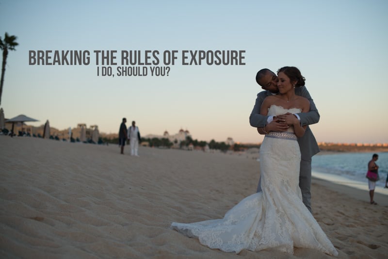
Orange and blue colors tend towards working well when you combine them either right next to each other or in different parts of your photo. For example, a bright sign against a dark blue sky is exceptionally contrasting and easy to see. A clear blue sky is the most common source of blue color, so photographers often look for subjects to contrast against it.

Creating Orange and Blue Images in Photography
Here are the main reasons to use orange and blue in your photography.
The Two Complementary Colors with the Highest Contrast
Orange and blue have exceptionally high contrast even when compared to other complementary colors, which makes things easy to see with little or no editing on your part. Put simply, these colors contrast so well that they’re naturally easier to use than, say, white and pink. Colors matter when you’re taking photos, so keeping them in mind helps.
Blue and Orange Represent Opposites and Emotions
Similarly, these colors have a lot of emotional weight to them. Each of them represents a variety of opposing concepts, such as hot and cold, natural and artificial, and even passionate and distant.
No other color combination is quite as effective at this because blue and orange are in the middle of the warm and cold sides of the color wheel. All the other cold colors are warmer than blue, and all the other warm colors are colder than orange.
Representation Natural Light
Blue and orange are also the closest colors to ambient light. This is especially true of orange shades, thanks to the light from the sun, but blue still has an ambient feel because we associate it with the sky. A little bit of white can help, but white isn’t as natural as colored light.
Keep in mind that cameras notice the different hues of light, even when you don’t. You may need to fiddle with the settings on your camera to get your image to turn out correctly.
Works Well with Various Skin Tones
Finally, orange colors, in particular, are close to human skin color for people with lighter skin tones. For paler models, adding blue colors to the background can help it naturally contrast with models and make them pop out more effectively.

For models with darker skin tones, you may need to do the opposite. Blue hues on a dark-skinned model and bright orange accents colors in the background are also distinct, although not quite as much as the other way around. Warm colors draw the eye better, so you may need to lower the brightness of your background and raise the brightness for your model.
Photography Tips for When Using Orange and Blue
Now that you know more about blue and orange colors, let’s go over some additional details about using it in photography. Remember, you can always edit hues later, so neither color has to exist in your initial picture.
Play Around with Blue and Orange Color Blocks
In this context, blocking doesn’t mean hiding or removing something. Rather, color blocking is the process of limiting colors to one area of an image, sometimes with a neutral color like gray to separate them. For example, a blue and orange photo might have a warm-hued brick building set against the blue sky, each taking up one half of the picture.
This works in part because of apophenia, which is the tendency to look for patterns even when they don’t necessarily exist. Something that implies a pattern, such as colors being roughly equal in an image, is often enough to convince people that there is one. Color blocking can use this to create more vivid and distinct images.
Consider Blue and Orange to Keep Images Looking Natural
Blue and orange are also great for giving a natural look to your photos. Orange isn’t actually common in nature outside of certain famous fruit and both sunrises and sunsets, but it still feels natural because so many things we see have a faint orange tint to them. Blue, likewise, feels like an outdoor color since it matches the sky and the ocean.
Other complementary combinations, such as green and red, yellow and gray, feel distinctly less natural. This is because while one of the colors may be common, the other isn’t, so it always feels faintly artificial.
Make Your Points of Interest Pop with Orange or Blue
To mix blue and orange are a great way to highlight points of interest in your photo. As mentioned above, if you can make the background one of these hues and the subject the other, they’ll naturally pop out from each other.
Orange is a little better for the main point of interest because it’s a bright, exciting, and energetic hue. Blue works better for backgrounds because it tends to come across as more relaxed. However, you can certainly invert these whenever you want, and that can produce some strikingly distinct images.
Highlight Your Details with Some Blue and Orange Contrast
Color contrast is a great way to highlight details. For example, with a photo of 1 5k run, using orange for the winning athlete and the finish line can make their activity stand out, while blue hues help everything else fade into the background.
Details are important in photos, but if they blend in too easily, your image won’t be as effective. I’ve answered related questions 250 or more times, literally, and my answer is the same: natural contrast is the best way to highlight the important details in an image.
However, color isn’t the only way to create contrasts. Remember that elements like size and brightness also impact the contrast. Blue and orange are just naturally better for this than other colors.

Skip The Brightest Shades of Each Color
This principle is simple: always try to avoid using the brightest shades of blue and orange. They may contrast well with each other, but the bright shades are too bright and hard to make out in a picture. Dimmer shades are significantly easier on the eyes. Fortunately, you can adjust the brightness in editing, so don’t worry too much if your initial picture is a little off.
Avoiding Overkill and Adding Variety to Your Color Palette
Finally, you don’t need to limit yourself to the two colors we’ve talked about here. Images can and often should have more than two colors. Green and brown can help to provide variety in an image, while a small splash of red or yellow can brighten things up without being too distracting.
When adding some variety to your palette, keep the balance of the image in mind. Other colors shouldn’t be distracting, but you can add them as complementary colors to help improve the final work. It often helps to place darker colors against a brighter background to create a better contrast between all the colors in your photo.
Are you still unsure about adding color to your photos? When you ask questions more answers will come, and I’ll use the feedback you provide to answer the requested topics. Managing colors in photos can be challenging until you’re used to it, so don’t be afraid to look through image galleries for inspiration.
![Personal Branding Photography Basics [Complete Guide]](https://colesclassroom.com/wp-content/uploads/2019/06/adorable-adult-beautiful-774095-768x512.jpg)