One of the most valuable tools, but perhaps one of the most misunderstood, is your camera’s histogram. Histo-what? We aren’t talking about Instagram’s cousin here. If you’ve been confused by that fancy chart they call a histogram, you’re in the right place!
Looking to improve your photography?
Just enter any questions you have about improving your photography below and hit send and get answers & feedback instantly - for FREE!
Submit Questions
In this tutorial, we will break down using a histogram so you understand what your histogram is saying and how to use the information it provides to get the exposure you’re looking for. Finally, your histogram explained!
What is a Histogram?
The histogram helps you understand how light is distributed in an image. It is a graph that shows the distribution of pixels in an image, with the shadows are represented on the left, the highlights on the right, and the midtones in the middle. The height of any of the points on the graph indicates the number of pixels in that particular tone.
What Does the Histogram Mean?
The histogram simply tells you what tones are represented in your image, and can guide you in making decisions in your exposure and processing. When it has information climbing up on one side or another, it means that there are pixels in your photo that are either completely underexposed/black (on the left) or overexposed/white (on the right).
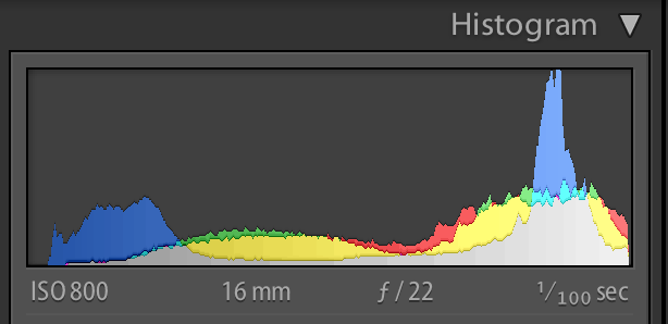
In the chart above, we could assume that this was a histogram of a well-exposed image because there is a nice dynamic range of tone represented in the image, without a lot of extreme shadows falling off to the left or extreme highlights falling off to the right.
Because they are simply a representation of details, there are no “good” or “bad” histograms, unless the entire histogram is bunched up and spilling up all the way on one side. This would be representative of a completely underexposed or overexposed image.
Traditionally, a well-exposed image will reach from one side of the histogram to the other, peaking in the middle, and without falling completely off of either side, as in the example above. However, this does not apply in every situation, and certainly can be relative to your artistic goals. We will discuss this more in a moment.
Finding the Histogram
Wondering where to view the histogram? You can choose to have it appear on your camera’s LCD screen during your image playback. Consult your camera manual to find this function, as all cameras have different menus, interfaces, and settings. You can also view the histogram for your images in your editing software, like Lightroom or Photoshop.
Reading Histograms
If you learn how to read a histogram, you get a guide in managing camera settings and working on post-processing photos.
Since histograms arrange pixels from dark to light, the first thing you must do is check if any of those pixels are cut off on either side. If the pixels go off either on the right or left edge, the exposure will leave out details you won’t recover in post-processing.
Here’s a simple reminder when reading histograms:
Pixels cut off on the left-hand side = exposure is too dark = leaving out the shadows or dark parts
Pixels cut off on the right-hand size = exposure is too light = obscuring the highlight detail in the brightest areas
Evaluating the Tones
The histogram’s edges show if you’re using the correct exposure. Meanwhile, the valleys and peaks indicate an image’s dynamic range or the range of light you captured.
When you read the histogram, you will also see a photo’s blacks, shadows, mid-tones, highlights, whites. In even lighting conditions, the histogram will peak in the middle. If there’s more light, there will be peaks in the shadows and highlights.
While adjusting the exposure can widen those peaks, histograms may also provide clues if you need more light into the scene. Try adding a fill flash if you’re missing the mid-tones. When the histogram is showing plenty of highlight peaks, consider lowering the exposure.
Checking the Contrast
If you want to learn how to read a histogram, you must understand how peaks signify an image’s contrast. Peaks that slowly build from the edges imply a high contrast scene, while peaks that gain height fast suggest a low contrast scene.
Changing the contrast based on histogram should depend on the mood you want to set for an image. For instance, soft light will have less contrast than a dramatic shot with hard lighting.
Adjusting Exposure
Some photographers are used to seeing histograms as exposure’s graphical representations. Thus, only a few evaluate exposure based on histograms alone and state them as either “good” or “bad”.
Good Histogram: Typically renders most tones in the middle part of the graph with no few tones at the extreme edges.
Bad Histogram: Implies tones at the very edges of the graph, indicating either overexposure to the point of highlight clipping or underexposure to the point of shadow clipping.
Gaps on either end mean you are missing information. The good thing is that you can still change the exposure without losing detail. If the graph shifts too far in one direction, you can modify the exposure to cover more of the range of tones.
Shadow and Highlight Clipping
Clipping indicates a loss of detail when a particular part of the histogram touches either edge of the graph.
Highlight Clipping: This happens if the graph is touching the histogram’s ride side. As a result, portions of an image are entirely white and lack detail.
Shadow Clipping: This implies the graph is touching the histogram’s left side. In effect, some areas are completely black and lack shadow detail.
You can always modify the exposure if you notice highlight or shadow clipping.
To save highlight detail, dial negative exposure compensation at around -0.3 to -0.7 to make a photo darker. If you want to save shadow detail and make an image brighter, dial a positive exposure compensation value at around +0.3 to +0.7 to save shadow detail.
Using Color Channels
Learning how to read a histogram means getting information on the three primary colors: red, green, and blue. With RGB histograms, you can also see several diagrams marked with various colors.
The gray diagram displays where the colors red, green, and blue overlap. Meanwhile, cyan, magenta, and yellow show where two of the primary colors overlap.
Reading Blinkies
Another way to learn how to read a histogram is by getting used to a highlight warning or “blinkies”. To help you decide the extent of an image’s brightening direction, most SLR cameras will make overexposed “flash” or blink on a camera screen’s preview.
Examples of How to Read a Histogram
First, let’s take a closer look at what the histogram is telling us. Here is the histogram for this image taken on the beach.
You can see that the histogram for this image spreads pretty evenly from left to right, with some peaking falling off on the right-hand side. That tells us that in this photo, there are a tones represented from dark to light, with some true white pixels (or overexposure) in the image. In this case, the blown-out sky is why you see some of the details climbing up on the right-hand side.
Here is another example where again we see that the histogram is spread pretty evenly across all tones from shadows to highlights, except this time you won’t see the peak for blown-out highlights on the right side.
Remember, we said that histograms, while helpful, can be relative. Some images do not follow an even distribution at all. For this image, you can see that it pushes almost completely to the left-hand side, with virtually no information represented on the right.
While technically, this is an underexposed photo, it’s range of shadows are what generate the artistic impact of the image.
Now take a look at this one. The majority of the information is pushed to the right-hand side because the image has mostly lighter, white tones. You can see that very little detail is represented on the left side of the histogram, meaning there are very few shadows in this image.
Neither of these histograms follow the balanced curve “rule,” but both are nice images, with their artistic value being found in the intentional use of black and white tones.
This reiterates the point that, while the histogram is a valuable tool for examining and evaluating the tones in your photos, it will likely vary greatly from image to image, based on what you are shooting and your artistic goals. Think of it as a guide for obtaining the type of exposure you are looking for, and not as an indicator of a good or bad photo.
Think of the histogram as a guide for obtaining the type of exposure you are looking for, and not as an indicator of a good or bad photo.
Conclusion
Your histogram is a valuable tool that can really make a difference in gaining the type of exposure you are looking for in your images. Hopefully, this helps you to better understand what your histogram is and how to read it to better interpret your photos!
Have you seen the term “noise” thrown around and wondered what exactly it is? Or maybe you’ve noticed that some of your images aren’t as crisp and clear as you want them to be, and almost have a grainy appearance to them. Digital noise could be the reason. By understanding what noise is and how…
In other posts, you’ve read about aperture (opening in the lens that lets light pass into the camera body) and how aperture affects exposure. Hopefully, after several experiments, you now have a feel of how aperture works. Looking to improve your photography? Just enter any questions you have about improving your photography below and hit send…
Today I’d like to address an ailment called ‘P.K.B’, or Photographer Kid Burnout. If you’ve ever tried to photograph your own kids, you may recognize the symptoms: Pouting. Screaming. Crying. Grumpy faces. Rolling eyes…. and that is just from us parents! The kids are at it too! Running away, hiding under the bed, making ridiculous…
There are three key elements in photography that work together with each and every image you take that creates an “exposure” – ISO, Aperture, and Shutter Speed. Looking to improve your photography? Just enter any questions you have about improving your photography below and hit send and get answers & feedback instantly – for FREE!…
So you’re finally getting out of the easy, automatic mode and experimenting with your creative side. Learning shutter speed basics and how to control the shutter speed settings is one of the most important things you can do to improve your photography skills. Understanding Shutter Speed (A quick overview) The shutter speed definition is the…
Have fun and save some time and money with these 40 photography hacks! Ever had a friend share a photography tip and you thought “Why didn’t I think of that?” Well, here are 40 new reasons you can say that! We’ve got photography hacks for weddings, portraits and even product photography! From creative DIY ideas…