
Contrast is one of the most essential components of photography. When used effectively, it creates clarity, texture, shadow, tone, and light in an image. It can help you draw attention to particular elements of a photo or even emphasize your subject.
Looking to improve your photography? Just enter any questions you have about improving your photography below and hit send and get answers & feedback instantly - for FREE! Submit QuestionsIn this article, we’re going to concentrate on high contrast against low contrast photography. Both produce dramatic effects that can enhance your work in different ways. Let’s take a closer look at what contrast is, how high and low differ, and how you can use it to improve your photos.
An Overview of Contrast
Contrast is the degree of difference between the tones and colors in a photo. You can think of it as the ratio of tones, or the ratio between the light and dark areas of an image.
High contrast and low contrast leave viewers with different impressions and change the impact and feel of your photos. For example, high contrast photos typically have less noticeable details but more evident textures, whereas low contrast ones possess more visible individual elements.
To create this tonal disparity, photographers can use several methods with high contrast and low contrast. You can adjust camera settings and light, alter your photos’ composition, or manipulate it in editing. Two of the most popular of these techniques are color and tone.
Color uses interactions between shades to enhance your photos, while tone is the variance in brightness in a photo. We’ll discuss using these methods for high contrast and low contrast in a moment.
High Contrast Photography
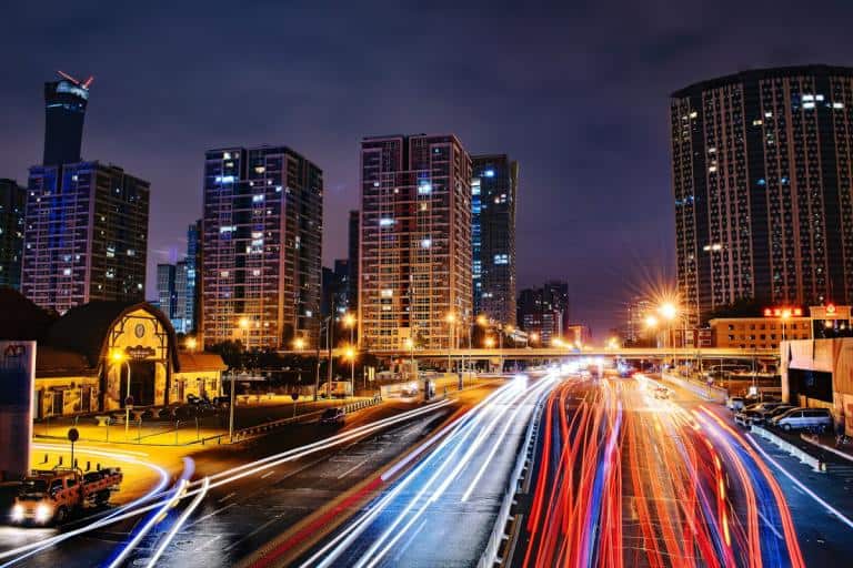
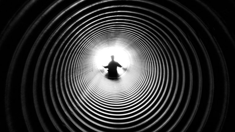
A high contrast image has an array of black and white tones characterized by dark shadows, vibrant pigments, vivid accents, and concentrated textures. They feature a complete range of black and white tones from very light to extremely shadowy. These high contrast photos are quite striking with an edgy, energetic, and powerful black and white vibe.
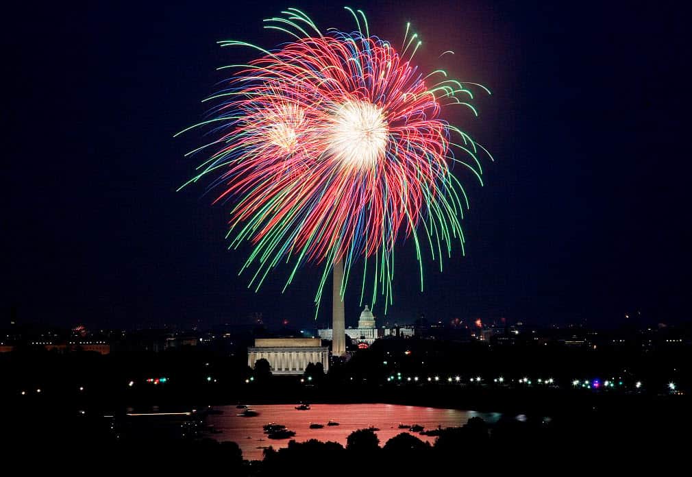
Street and nature photographers frequently utilize this high contrast method to make their photos pop and bring out the photo’s textures.

Low Contrast Photography
Photos with less contrast are soft with a smaller collection of tones are low contrast. Low contrast photos work mostly in gray shades, without any highlights or dark shadows. This fusion of shades ends up dulling the low contrast photo’s shades and making it appear dreamier.
Portraits, especially those taken outdoors, work well with this type of photography. This low contrast technique can also lend a vintage and more relaxed feel to photos because of its diluted appearance.
High Contrast and Low Contrast Using Color
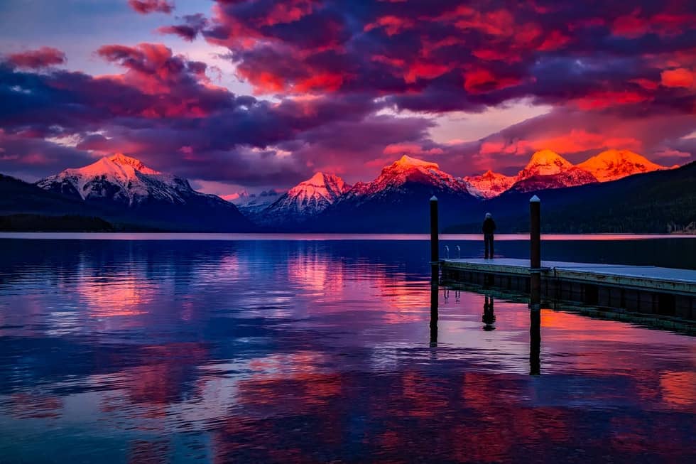
The most contrasting shades appear opposite from each other on the color wheel. Examples include red and green and blue and orange. Placing these shades next to each other will create a striking distinction and add sharpness to your shot. You can also juxtapose warm and cool shades.
For less color disparity, photographers can choose analogous ones that appear next to each other on the wheel, or use shades or tints of the same pigment for just a light distinction.
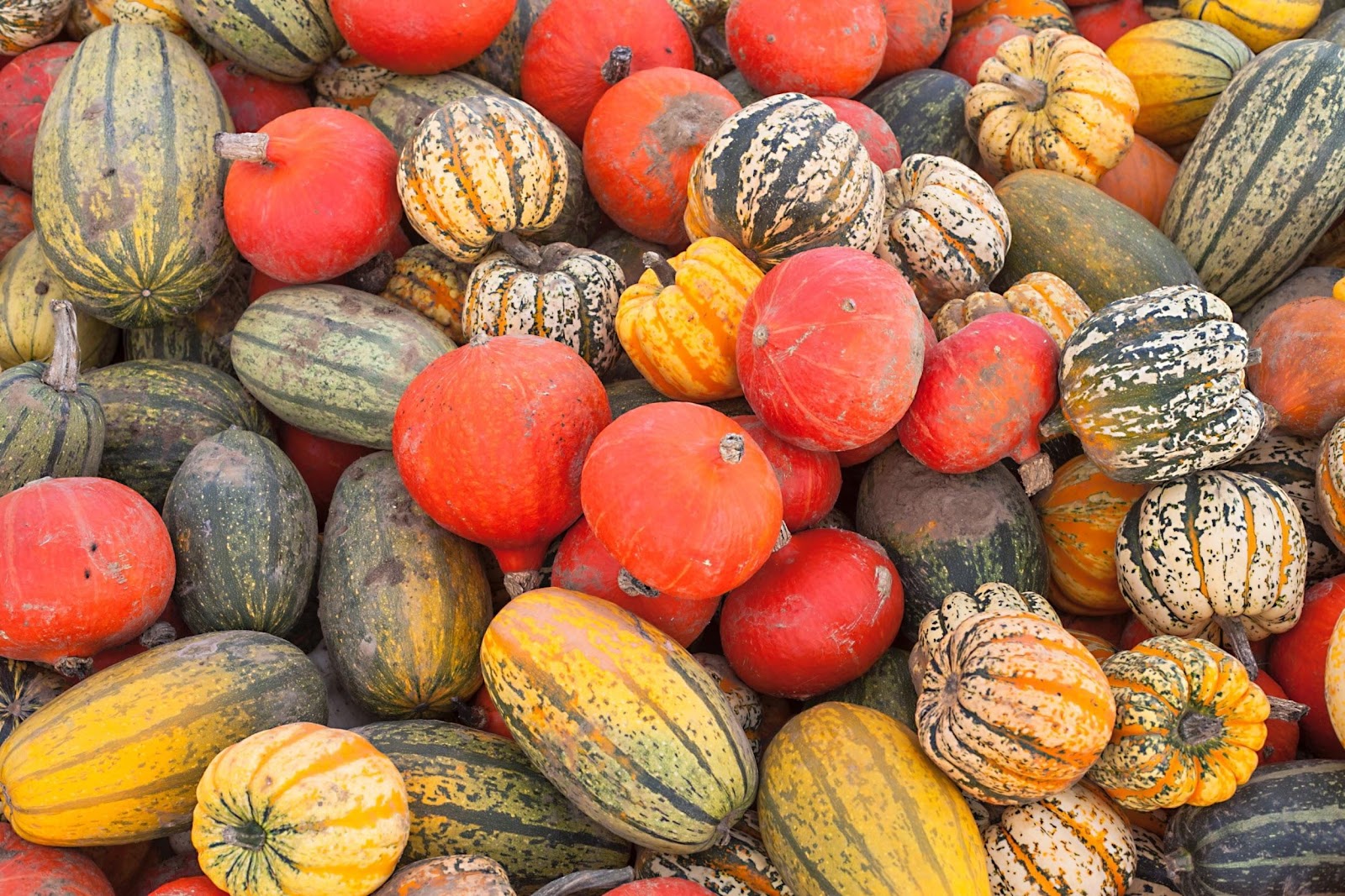
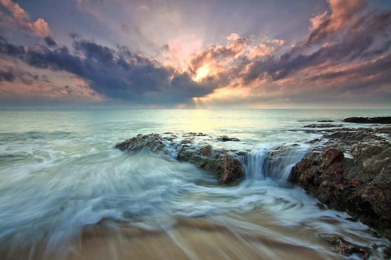
Photo by JD Designs Licensed Under CC0
High Contrast and Low Contrast Using Tone
Tone is most significant in black and white photography that doesn’t have any additional input from pigment. High tone contrast comes from the variability between very light and intensely deep tones.
To create less tonal variability in photos, photographers can feature an array of middle tones with no true whites or blacks. Similarly, a medium contrast image also has a range of tones but does includes pure ones.
Editing for High Contrast or Low Contrast
When editing for high contrast or low contrast, your decisions will depend on the look or mood you want for each particular shot. If you’re going for a severe or mysterious look, high contrast methods fit best. But for a light, laidback vibe, low techniques may be more appropriate.
In your editing software, you can use the contrast slider to increase or reduce the look of the entire image. Modifying the pure black and white tones of your photo can also alter the contrasts of your photo. Making whites lighter and blacks deeper will add disparity.
You can also use a brush tool to focus on particular light and dark areas of the image. All you have to do is paint the part of the photo you want to alter and adjust the slider until you reach your desired effect.
Wrapping Up
Contrast in photography refers to the degree of difference between the tones in an image. High contrast features a wide range of tones, from very shadowy to very light. Meanwhile, photos with less contrast have a narrower array of tones with less distinction in brightness.
When discussing low and high contrast photography, photographers must also understand the techniques they can use to get a low or high contrast, both in a photo’s composition and editing.
Tone and color are two popular ways to adjust the light and dark areas in a shot, while editing tools can also help add or reduce contrasts in post-processing.
The best way to develop an understanding of low and high contrast is to experiment with creating and adjusting it to various degrees. Once you master it, contrast will help you improve your photos by enhancing their clarity, texture, mood, and effect on viewers.