
Vibrance and saturation are two terms you are going to encounter when editing colors with a digital program. Both refer to colors and their intensity, but there are some important differences. Here is what you need to know about the difference between vibrance and saturation in photography.
You will find separate sliders for vibrance and saturation in Photoshop, Lightroom, and other editing programs. Here’s why.
What is Vibrance?
Vibrance is a saturation tool you will find in photography editing tools like Adobe Photoshop and Lightroom. The purpose of the vibrance slider is to bring life to muted colors without creating oversaturation in other areas of your image.
Looking to improve your photography? Just enter any questions you have about improving your photography below and hit send and get answers & feedback instantly - for FREE! Submit QuestionsSaturation is a useful tool, but this slider increases the intensity of every color in your image and can result in oversaturation or undersaturation and make the shot hard to read.
If you want a vibrance definition, think of it as a quick way of targeting muted colors, making them more vibrant, and preserving other areas like skin tones and colors that already look vivid.
What is Saturation?
Saturation refers to the idea of how intense a color looks. It makes your image look more vivid. You will sometimes find the term chroma used to refer to saturation in the context of photography.
As saturation goes down, black or white are added to a hue to make it appear soft and muted. When the slider is turned all the way down, your shot looks completely gray.
As you move the saturation slider back up, you can see your entire image come to life.

The Difference Between Vibrance and Saturation in Photography
These two photography concepts are very similar. They both refer to the intensity of colors in a shot, and these two sliders can be used to make the colors pop in an image.
However, saturation will enhance the intensity of colors evenly across the entire image, while vibrance will create a balance that looks more natural, especially in skin tones.
The Main Difference Between Vibrance and Saturation in Photoshop
The distinction between vibrance and saturation in Photoshop is important. If you adjust saturation, you will notice that muted colors are enhanced while some portions of your images don’t go through drastic changes, like skin tones or hair color.
Where Do You Need to Adjust Vibrance and Saturation
Saturation is a basic editing feature that you will find in any photo editing program. Vibrance is a quick tool that is available in the color editing panel of Adobe Photoshop and Lightroom.
The Observable Differences Between Vibrance and Saturation
The best way of understanding how vibrance and saturation affect your images is to adjust these two sliders when editing your images with the color panel.
You can compare a saturated edit of your image to the original version once you increase vibrance. You can also read about photography theory to better understand how you should edit these values.
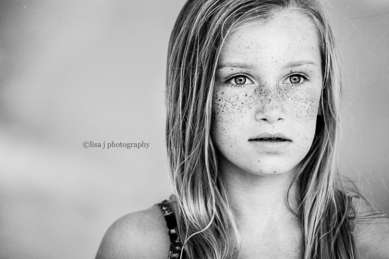
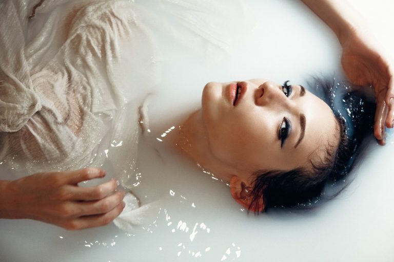
Portrait Photography
A portrait can look dull if you shoot during an overcast day or use poor lighting.
Saturation will make the shot more vivid and colorful, but your subject’s skin tones and hair can take on hues that don’t look natural if these colors are saturated.
Vibrance will enhance the background, props, and outfit your subject is wearing without denaturing skin tones.
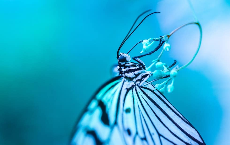
Macro Images
The purpose of editing macro pics is to make your subject pop against the background. You can use a mask to increase saturation for your subject and make some elements stand out against the background and help viewers read your picture.
Vibrance will preserve the natural color balance of your shot, but you won’t get a drastic difference between your subject and background.
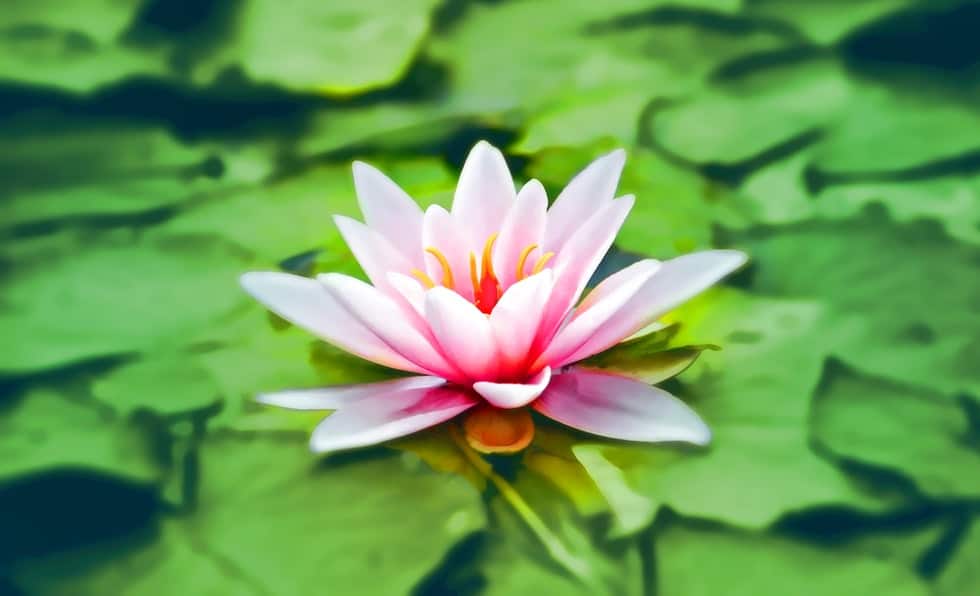
Landscapes Shots
In landscape photography, vibrance can give more depth to your shot. The colors will look richer, and you can adjust vibrance to find the right balance between the different elements of your composition.
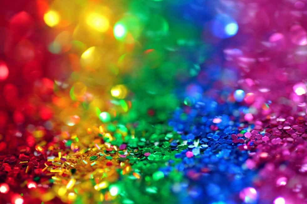
Saturation will have a much more dramatic result. It will bring all the colors up a notch for a vivid shot. This value can cause a landscape to look unnatural, but you can create a lot of interesting effects by adjusting the saturation slider.
Pet Photos
Increasing the saturation of a pet portrait can make fur look odd. The color of the fur might not look natural, and you can lose some details when you turn the slider up for something with a hairy texture.
Vibrance is a better option since it will enhance your background, and your pet’s fur will still look natural without being too saturated.
When Should You Use Vibrance or Saturation?
You should use the vibrance slider for portraits because saturation usually makes skin tones look odd. You should adjust the vibrance of your image if you’re looking for a subtle effect and want colors and skin tones to look natural.
You can adjust the saturation of an image if it looks dull or gray. It’s also a useful editing tool if you want to create a dramatic effect and want some vibrant colors. Note that you can use masks to have more control over the areas of your image where color intensity increases.
You can adjust the vibrance and saturation sliders together to increase the overall color intensity of the image while preserving a natural balance, and play with other features of the color editing panel.
Additional Questions
Here are a few additional tips for adjusting vibrance and saturation.
How Much Vibrance to Use in Lightroom?
The ideal vibrance value depends on the effect you are looking for. It also depends on the light that was available when you took the picture, and on the camera settings you used.
Some images only need a small adjustment to make colors look more vibrant, but you might have to turn the vibrance all the way up if a shot has muted colors. We recommend adjusting the vibrance slider until you get a result that corresponds to the effect you are looking for.
Adjusting Clarity
Clarity is another important concept you should know about if you’re interested in digitally editing your photos.
The clarity slider will adjust the contrast of your photos. The purpose of the clarity slider is to increase or decrease the contrast that exists between your middle tones, while the contrast slider will adjust the contrast between the light and dark areas of your shot. Increasing this value can make your images easier to read since details will stand out.
Conclusion
Adjusting the color intensity of a shot is a simple editing trick that can bring your photographs to life. Saturation is an easy tool to master, but it’s not ideal in some situations because it can make your image look unnatural.
The vibrance tool is a more subtle way of adjusting your color balance and preserving natural skin tones, even though it yields a result that looks a little less dramatic.