Use monitor calibration for better client images and prints
This is how my first journey down the rabbit hole of monitor calibration began.
Looking to improve your photography? Just enter any questions you have about improving your photography below and hit send and get answers & feedback instantly - for FREE! Submit Questions“Were you going for a really warm portrait stylistically? Because your images lately have been really yellow.”
This was a Facebook message I got from a pro photographer friend about six years ago, back when I was just a hobbyist photographer who loved shooting and sharing images. I honestly had no idea what she was talking about. My images looked perfect on my screen.
“Have you ever calibrated your monitor?” she asked.
“Uhhh…No?”
Again, I had no idea what she was talking about. Flash forward to today. Monitor calibration is part of my monthly routine to maintain image quality and keep my clients happy.
What is monitor calibration?
Monitor calibration is the process of measuring and adjusting the colors on your computer monitor to match a common standard.
To measure the color, you’ll use a device called a spectrophotometer or colorimeter that hangs off your screen. The device works through computer software to maintain the color of your images. But more on that in a minute.
Why do I need monitor calibration?
Each screen displays images differently. The same image will look different on my monitor versus my phone screen versus my client’s screen. The inner workings of the screen itself are different. The user may also have tweaked her settings for the screen. The result is images looking different from one screen to the next without any changes to the actual file being made. This can result in different skin tones and product colors from monitor to monitor.
So which version represents the “true” color, contrast and sharpness? And what about prints? Will your prints look liked you edited them? Will they be too dark? Too light? Too yellow?
That’s why monitor calibration is so important. Monitor calibration adds consistency to this situation. It works by attempting to employing a common standard so that any monitor using the standard will present the image in the same way. Professional printers are also calibrated to this standard so that what you see is what you print, so to speak.
Anyone printing and selling images should make monitor calibration part of their standard routine. So should anyone who earns their living with precise coloring, like graphic designers.
An example
Below is an image I posted online about six years ago that I thought looked like the bomb-diggity based on my uncalibrated monitor. Please bear in mind that this was when I was just a mom with a nice camera and free editing software. But still, in my mind, the color was spot on.

As you can tell, this image is entirely too warm and the sharpness leaves a little to be desired. But at the time on my HP laptop this was perfection. Even now on a different laptop screen, the image looks fairly sharp. But when I pull it up on my big, external monitor it makes me want to cry and not with nostalgia over my then one-year-old. After editing this image on a calibrated monitor, this is more in keeping with how it should look (sorry I can’t do anything about the blurriness. I’m sure I was shooting at too low a shutter speed.)

Another example, this time a photo taken in Hawaii. Yes, it’s a colorful place. But my uncalibrated monitor had me seeing green. And yellow. The second photo is more in line with what it should have looked like, had I edited it on a high-quality calibrated monitor. (Please forgive me for the multitude of photography sins I used to commit on a regular basis. I’m trying to make up for it now by educating other photographers!).


What tools do I need to calibrate my monitor?
In computer and online testing sites
Some operating systems, like Windows 10 and MacOS, offer local calibration tools. There are a handful of online testing sites you can use to calibrate your monitor visually. These sites, many of them free, can help you adjust everything from brightness and contrast to screen colors. Some examples are:
- PhotoDay
- Lagom
- WHZT
The problem with these online tools is they are relying on the user’s vision to make adjustments and compare it to a known standard. So your adjustments are only as good as our own eyeballs. And that isn’t good enough for professional work. As many as 1 out of 255 women and 1 out of 12 men have some form of color vision deficiency. And our vision and perception of hues are influenced by the colors and lighting around us, our gender, our age and our level of tiredness.
And if the monitor’s colors aren’t that great to begin with? The results aren’t going to be correct. These operating system and online tools are good for quick fixes and can help some people. But for the most accurate results, you’ll need something more sophisticated.
Don’t believe me that we don’t all see color the same? Take this free online color challenge. The results might surprise you!
Monitor calibration kits
Professional photographers, videographers and anyone else whose earnings depend on spot-on colors, want to invest in a monitor calibration kit. The kit should include the spectrometer or colorimeter, software and instructions. Here are a few of the common kit brands:
- ColorMunki
- X-Rite
- Spyder
- SpectraCal
These tools don’t rely on the user’s eyes to make adjustments. Instead, a monitor calibration kit compares the monitor’s color output with known colors through a combination of hardware and software. Many of these brands have different versions of their monitor calibration kids, with the more expensive kits touting additional features and customization. If you’re printing in-house, you’ll want to ensure that your kit can calibrate your monitor and your printer for the best results.
Which monitor calibration tool is best?
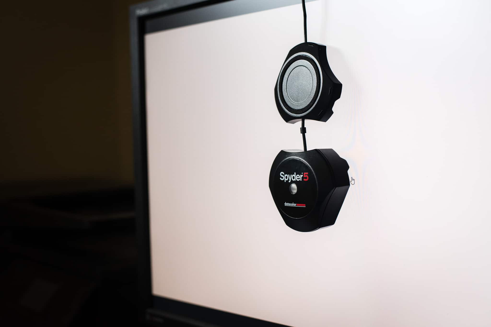
I know professionals who use and swear by all three of these brands and use all different versions. The three professional printing labs I use most often also each recommend a different brand. I think any of them will give you high-quality results. I personally use the Spyder5 Express by datacolour. It was incredibly easy to understand the first time and my results with it have been spot on.
Monitor calibration kits will cost you anywhere from $125 to $500 or more, depending on the product and what accessories you get bundled with it. For example, X-rite offers a bundle that includes the hardware, software and their “ColorChecker Passport.” The ColorChecker Passport is a little case you include in your shot that has known colors displayed. Then you use the image with the Passport in Lightroom to white balance your image. It’s a great tool, but not something you need to calibrate your monitor. So just make sure you aren’t buying more than you need when you purchase a monitor calibration kit.
How do you calibrate a computer monitor?
The monitor calibration process starts with installing software on your computer. Then you’ll connect the colorimeter to your computer via a USB port. The colorimeter hangs on your monitor and takes readings on the monitor’s output to measure color, gamma, brightness, contrast, etc. Using these readings from your monitor, the software removes any color casts and optimizes your settings. The software stores these “correct” settings and loads them each time your system reboots. If your monitor uses look-up-tables, these profiles can be stored in the monitor itself. Photo editing images like Adobe Lightroom and Photoshop also use the corrected profile when displaying images to give you the most accurate color display possible.
The whole process takes about six minutes on my system.
It’s important to follow the instructions of the monitor calibration kit. But here are some general best practices for monitor calibration.
- Make sure your monitor is in a location free of direct light (natural or artificial) that could skew the results.
- Let your monitor warm up for a bit, usually 15-30 minutes.
- Check for any software updates for your computer before beginning the process.
- Calibrate regularly for best results. Most monitor calibration companies recommend calibrating at least monthly. Set an alarm on your phone if you need help remembering.
- Most colorimeters come with a protective cap. Don’t forget to take yours off.
Monitor calibration and professional prints
Once you’ve calibrated your monitor, it’s time to order test prints from your lab. Only then can you be sure that what you’re seeing matches what you’re client receives as prints. Most labs will offer free or discounted test prints to help ensure what you’re seeing on your screen matches the results from your printer. After you receive your print, pull up the images and compare the two to see how your edit matches the print. If the print is representative of your edit, congratulations! Your workflow is now correctly managed and you can switch to maintenance mode.
If you calibrate your monitor and your prints don’t match your edit, contact your lab directly and have them help troubleshoot your problems! You’ll want to be sure you used the correct color space,
A few things to remember:
- Monitors are backlit while prints are reflective. The two won’t match exactly, especially in terms of brightness. But they should be close.
- The printing process and material being printed on can affect color and saturation. Metal, wood, canvas and even different types and weights of paper will alter the look of your images.
- Some laptop screens won’t ever calibrate correctly. Believe me, I own one.
Looking for a professional print lab? Read this!
[ad id=’3′]
Monitors matter
You spend hundreds, if not thousands of dollars on your camera and lens to improve the quality of your images. So don’t cheap out on the monitor! My best advice is to invest in a monitor that is designed for photography and other color-dependent work. What to look for in a good monitor could be its own tutorial, but research photography monitors and read reviews from other photographers on what they are using. Also know that most print labs recommend that you DO NOT do color sensitive work on laptop screens because they are notoriously unreliable when it comes to color reproduction. Even after calibrating my laptop screen, it’s still the pits. So I rely on an external monitor instead of my laptop for all my photo editing. Your laptop screen might be great…but if you’re constantly having issues and are editing on a laptop, you might consider a better monitor.
Click here for our recommendations on photo editing monitors!
But what about client monitors?
In a perfect world, everyone’s monitors would be calibrated and we’d all be using the same color space. If you offer digital gallery proofing, you might run into an issue where your images have color issues on a client’s monitor. There’s not a lot you can do about that, other than to educate your client and help them find a better screen for viewing.

Understanding Color Space AKA Help! My images look great in Lightroom but when I upload them to my website or send to the printer, they look weird!
Okay so weird isn’t photography term. But it should be.
If you’ve calibrated your monitor but your images are still wonky when viewed outside of Lightroom, you might have a color space issue. Color space is basically the range, or spectrum, of colors that is available to your camera, monitor or printer. The main color spaces photographers use are sRGB, AdobeRGB or ProPhoto RGB.
If you want an explanation of color spaces in more detail, check out this great video below. He explains it so much more completely and succinctly than I could. But in a nutshell, for accurate color from camera to printer, you’ll want to sync your color space across your camera, apps and export settings. And that color space should be the one recommended by your print lab. Most labs will accept either sRGB or AdobeRGB. The key is to pick one and stick with it for all your devices.
Note that if you’re shooting RAW, it doesn’t matter because the color space isn’t assigned until you get to Lightroom, CameraRAW, etc. But Lightroom should match Photoshop and both of those should use the color space recommended by your printer.
Wrapping Up
You wouldn’t give a client unedited images. Why? Because they are unfinished, so to speak, and might not correctly reflect your style. Neither then should you edit on an uncalibrated monitor. Stop leaving the consistency of your work and the quality of client prints up to chance. Invest in a monitor calibration kit, order test prints and compare. Complete the calibration process monthly. Stay on top of your color spaces and ensure your client experience is complete from shutter click to print delivery. It’s the mark of a true professional photographer, videographer or designer.